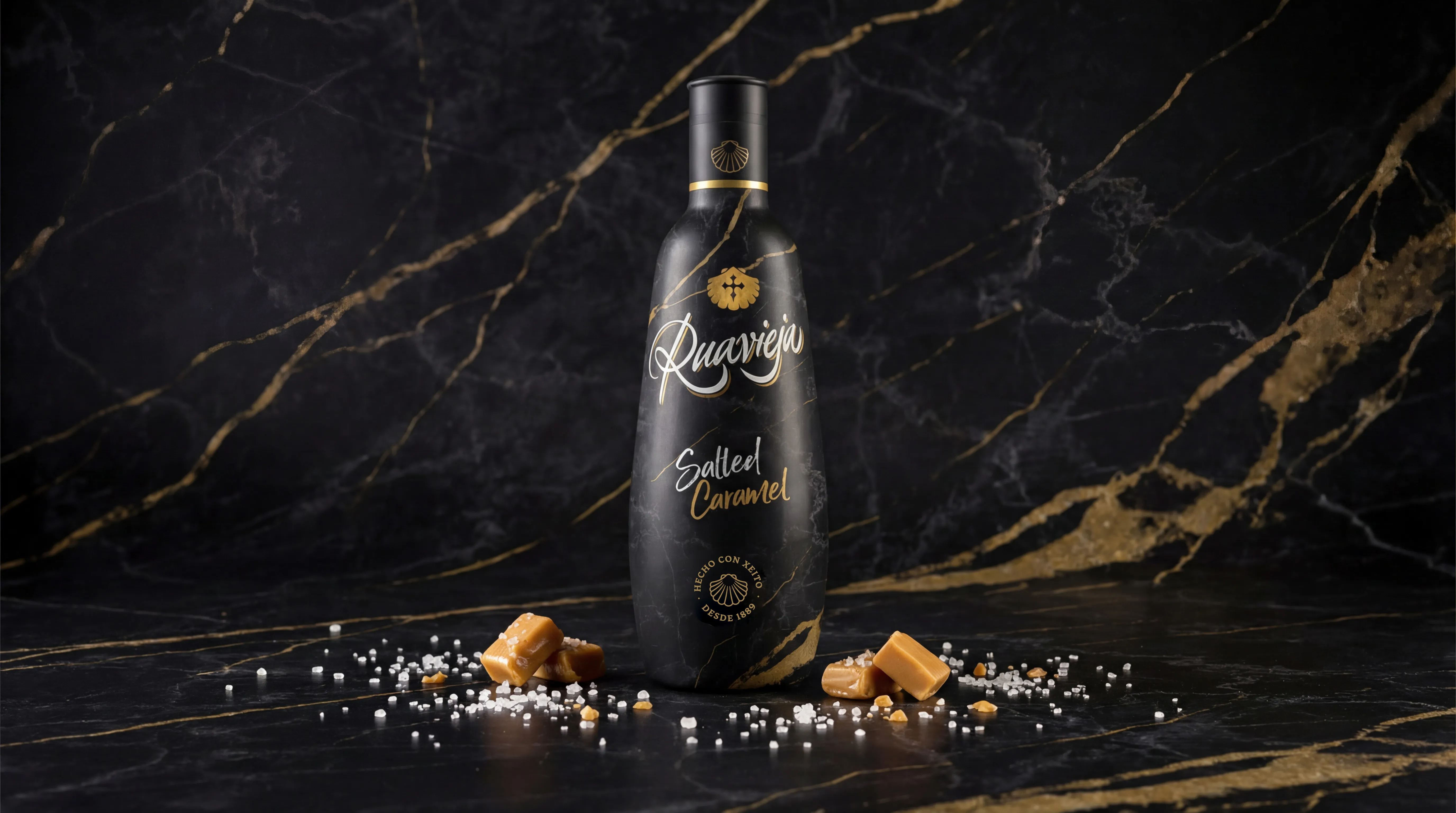
RUAVIEJA · SALTED CARAMEL
Branding
Art Direction
Packaging
Launching in the Spanish Market with a Premium Perspective
Ruavieja Salted Caramel was introduced to the Spanish market as the adaptation of a liqueur already established and successful in Portugal. The challenge was not to reinvent the product, but to launch it with a visual identity capable of generating desire, differentiation, and a strong premium perception from the very first impact.
The art direction focused on the bottle design as the core strategic asset.
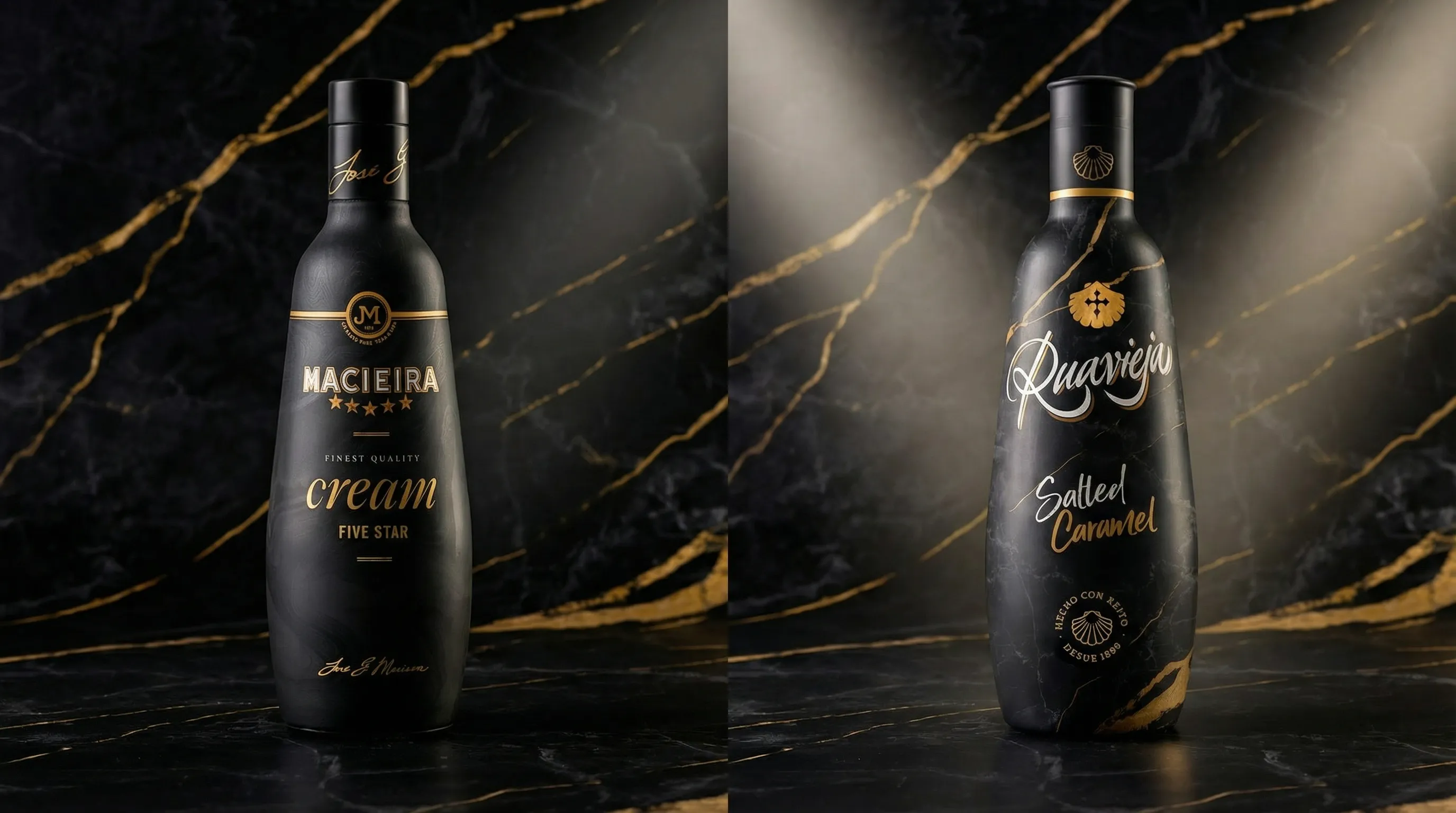
Building on the Portuguese reference, a black marble texture with white and gold veining was developed to introduce a new visual code into the Ruavieja universe. Marble — a noble and timeless material — conveys strength and elegance; the gold veins enhance perceived value; the overall result projects contemporary sophistication while remaining aligned with the brand’s visual language.
The objective was clear: launch the product in Spain with a strong shelf presence, capable of competing within the premium liqueur segment and connecting with a 25–40-year-old audience that values design and brand experience.
The design remains coherent with Ruavieja’s DNA while introducing a fresher, more refined aesthetic that strengthens its distinctive character.
As Art Director, my approach was to treat the packaging as a conceptual brand construction: every texture, finish, and formal decision responds to a strategic intention. This is not just a bottle — it is a piece designed to position itself with authority and communicate elegance before a single word is read.


Next project
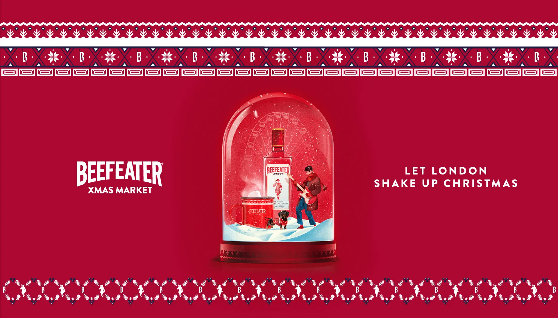
BEEFEATER XMAS